Behind the Label: Hexameter

As Madeleine Corson Designs imagined our OVID Hexameter label from concept to existence, they drew inspiration from the pages of early letterpress books. Each reference page – more intricate and elegant than the last – informed the typeface and design for our flagship wine label. You may notice similarities, too, as fonts used on the Hexameter label come from the same font families as the OVID Napa Valley label. These fonts were designed to emulate that of illuminated manuscripts and were made custom with our packaging in mind. Eccentric and embolden, they come to life at the winery.

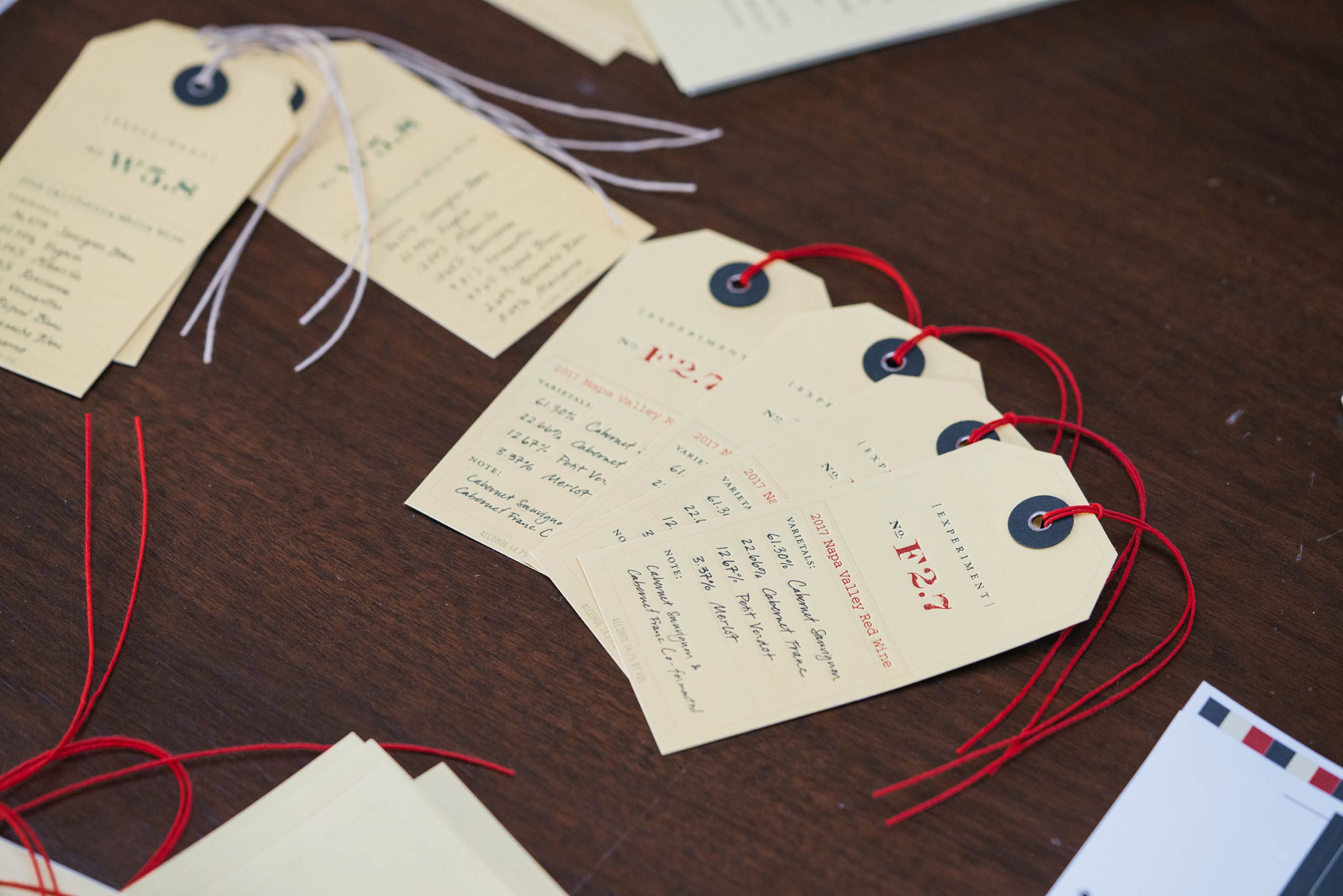
Seemingly simple flourishes like the dingbat and braided detail around the Hexameter icon again reference the intricate etchings of illuminated manuscripts. Each year, the Latin phrasing around the icon is updated to reflect the wine’s vintage while the intertwined tails of the hippocampus remain a perennial staple in the center.

From afar, the consistency of the packaging is comforting and inviting but those with a keen eye for detail will notice the slight changes that occur vintage to vintage. Not unlike the label, the wine inside the bottle shares a similar personality to past vintages of Hexameter but those with a discerning palate will be able to taste and smell the differences that each vintage brings to the wine.